Welot is producer and manufacturer of Computer and Digital accessories.
Problem: Creating differentiation in the crowded market of original and fake digital products and computer accessories and conveying a sense of confidence in the quality of the products.
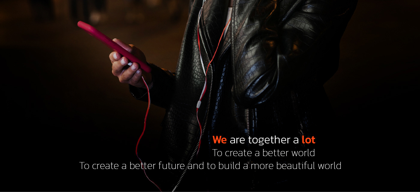
Strategic solution: Most competitors focused on products when introducing their brand, but we focused on human communication and introduced products as a tool for better communication between people.
Strategic solution: Most competitors focused on products when introducing their brand, but we focused on human communication and introduced products as a tool for better communication between people.
What I did:
Defining small brand strategy & brand story.
Choosing brand name.
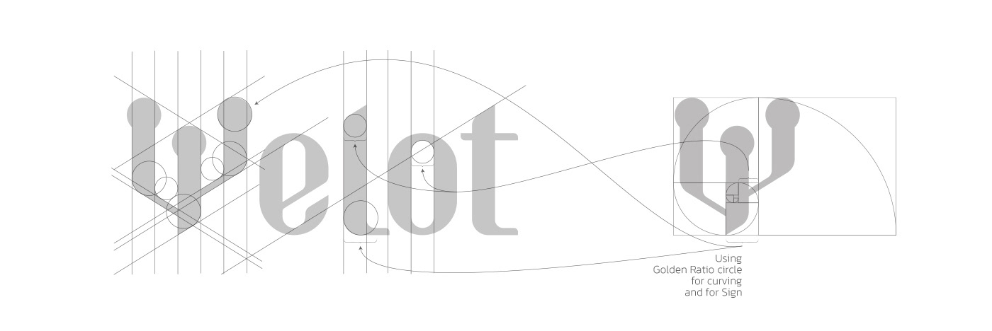
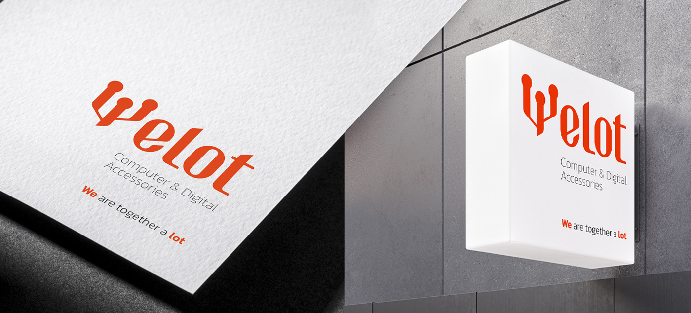
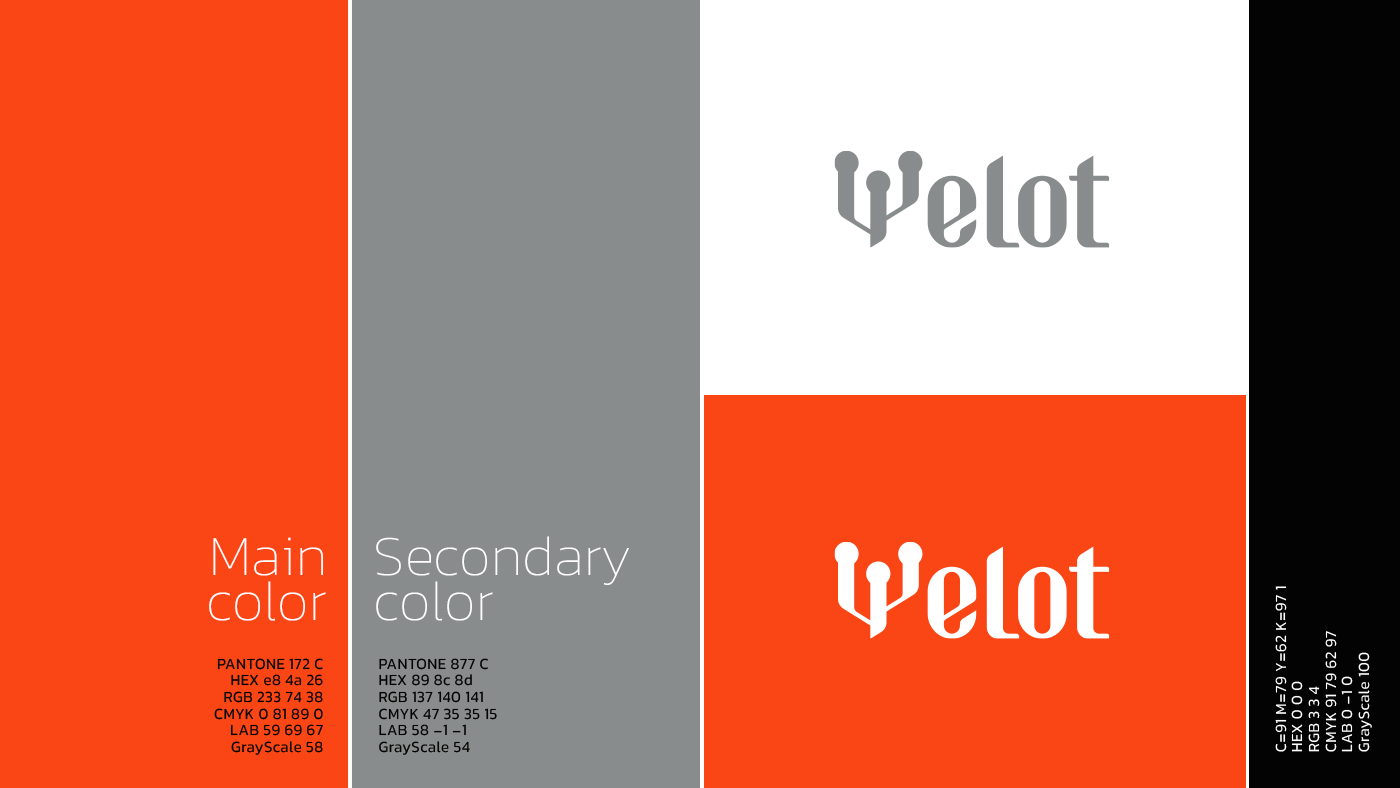
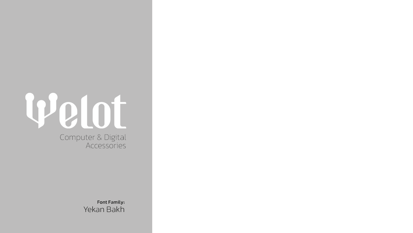
Logo and visual Identity design.
Packaging design.
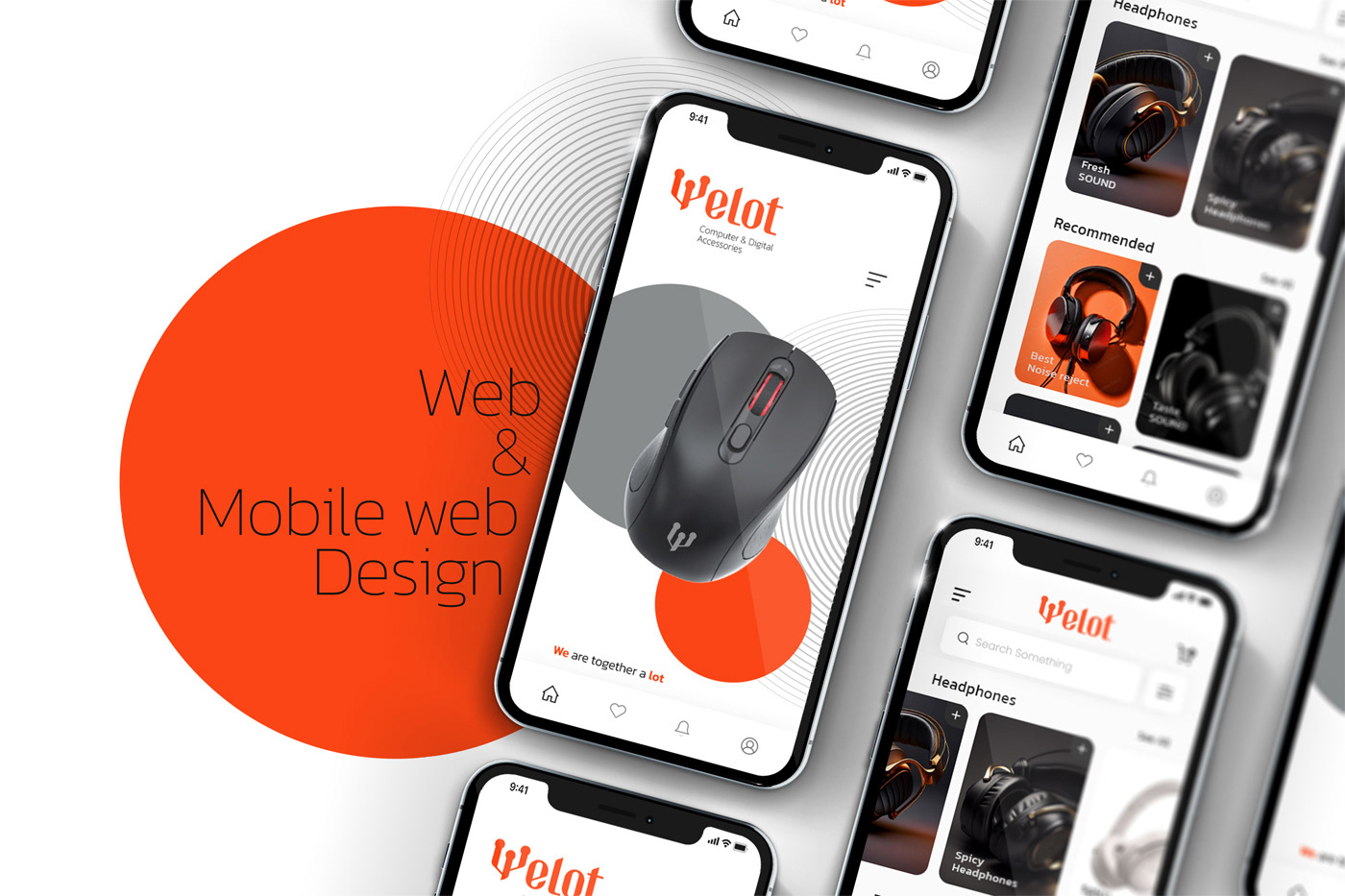
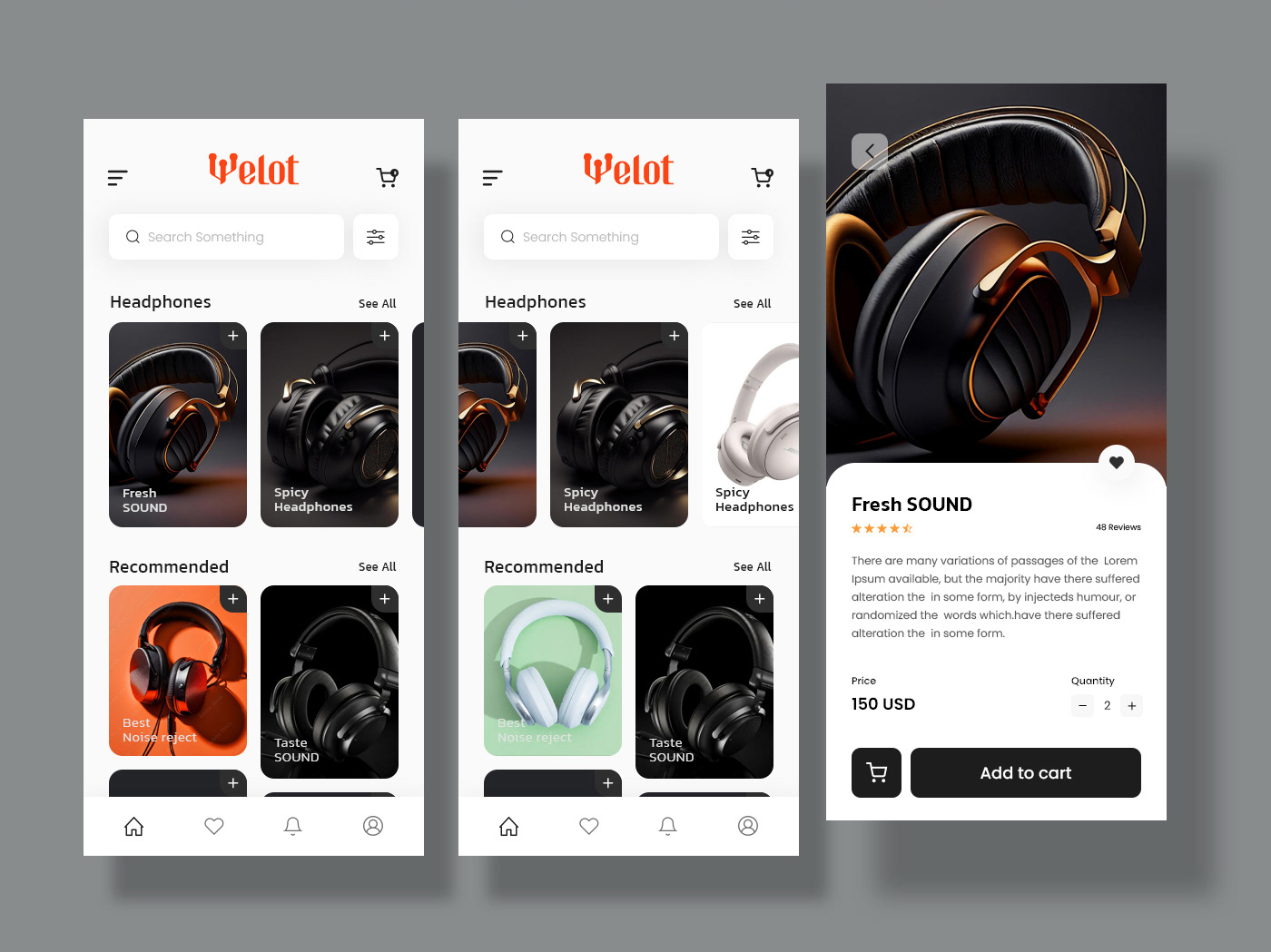
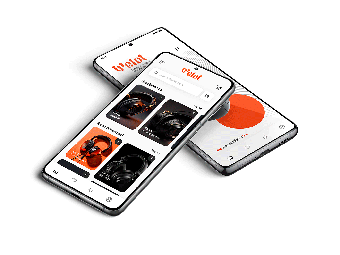
UI and UX design.
Defining small brand strategy & brand story.
Choosing brand name.
Logo and visual Identity design.
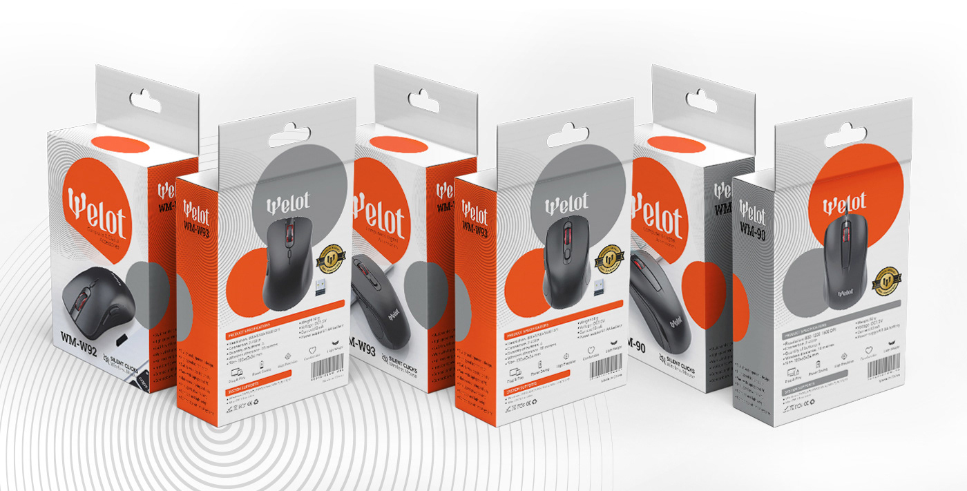
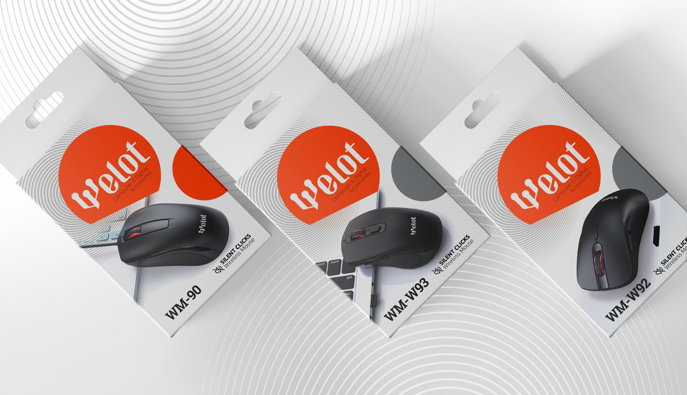
Packaging design.
UI and UX design.
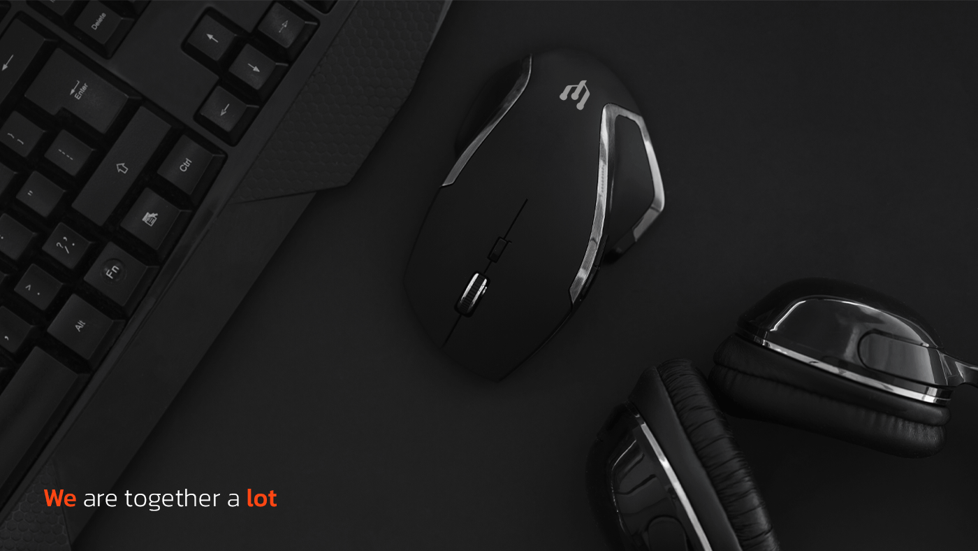
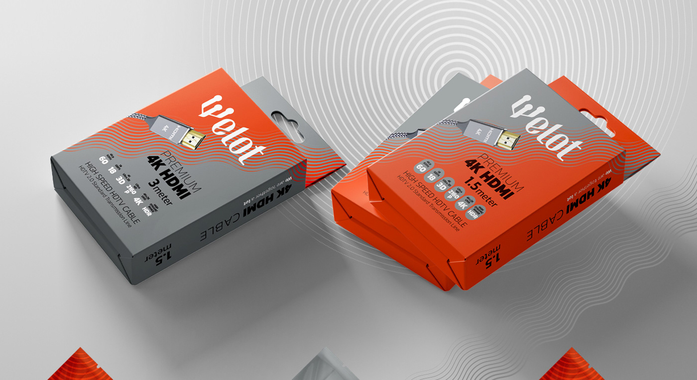
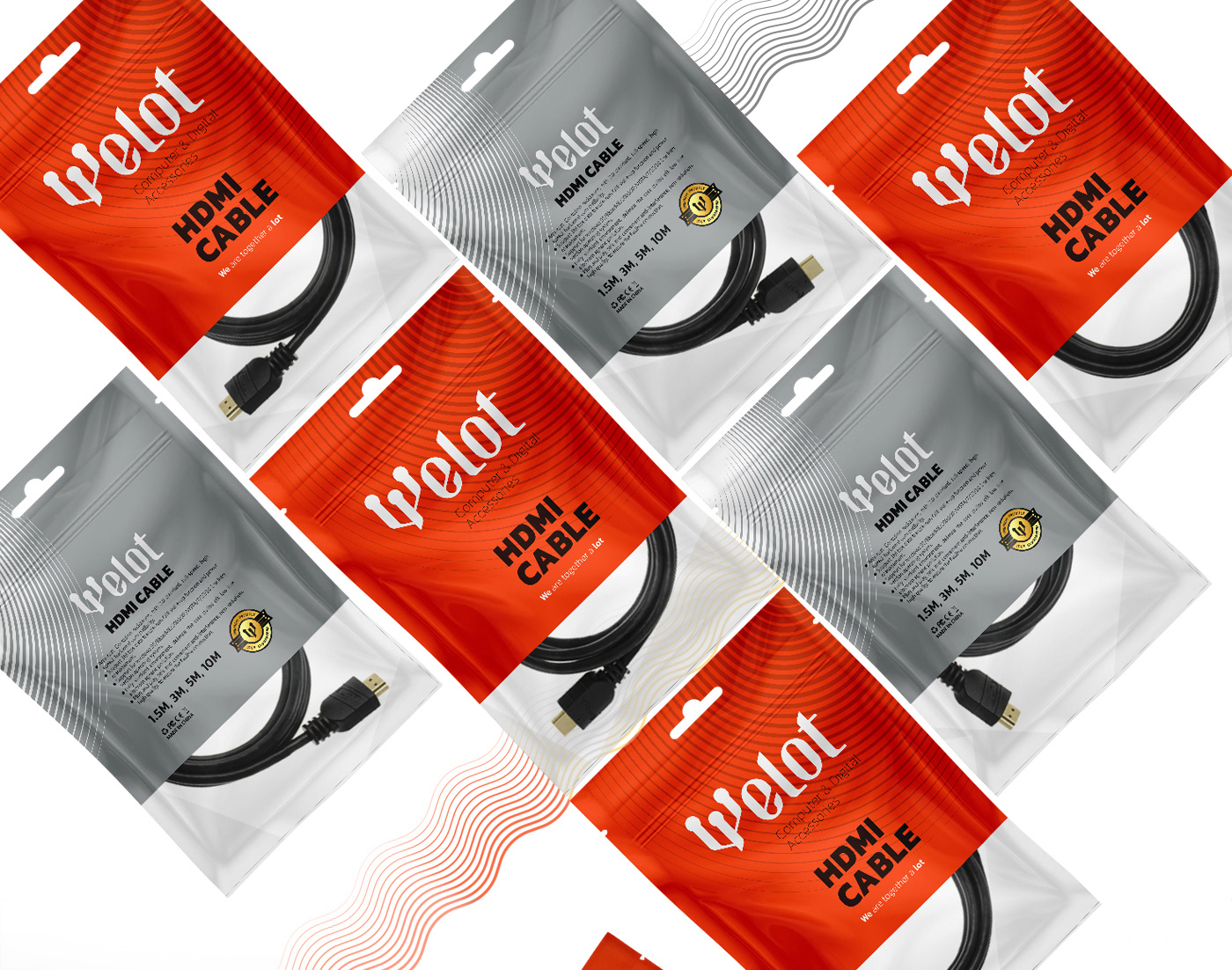
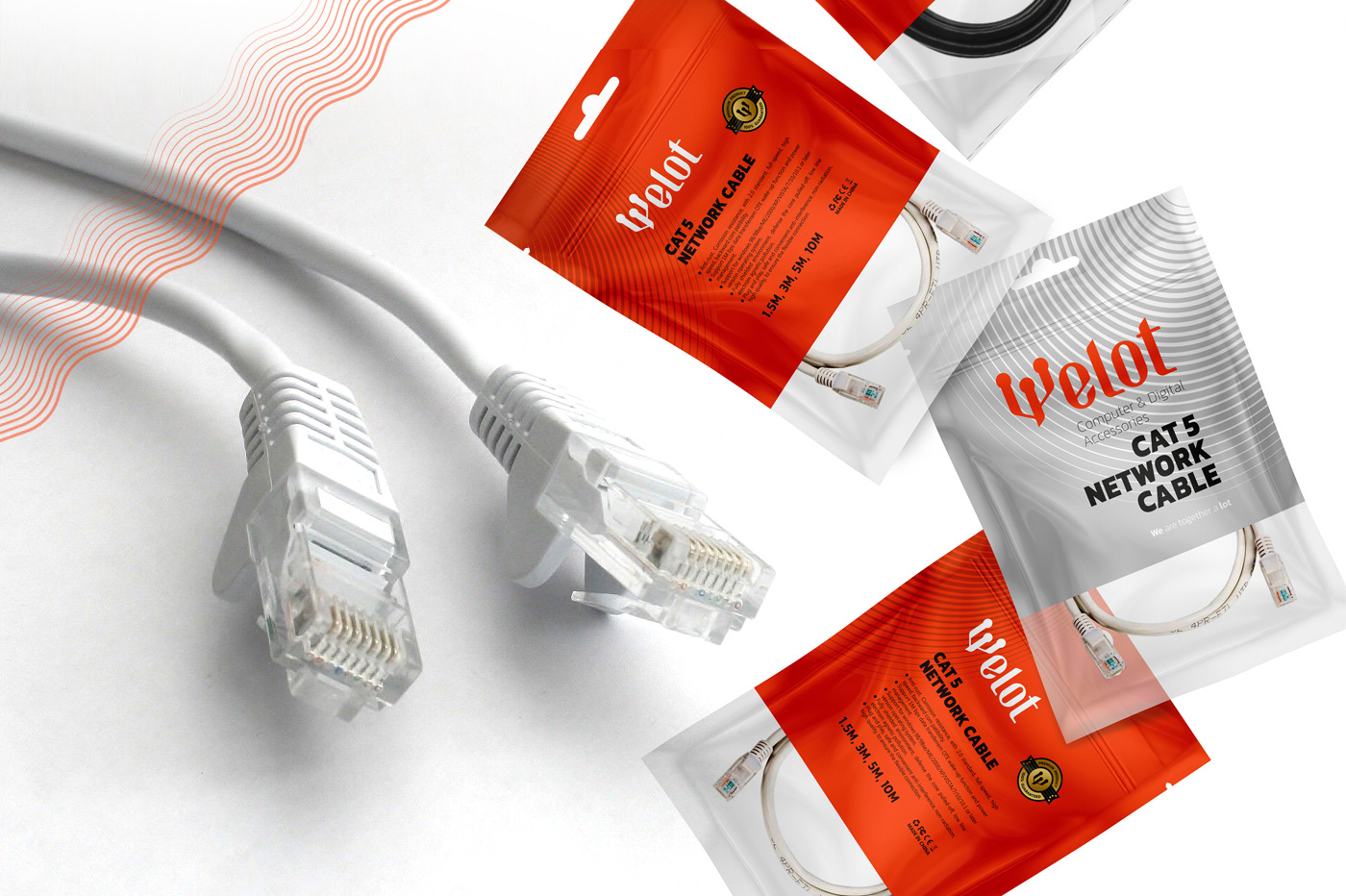
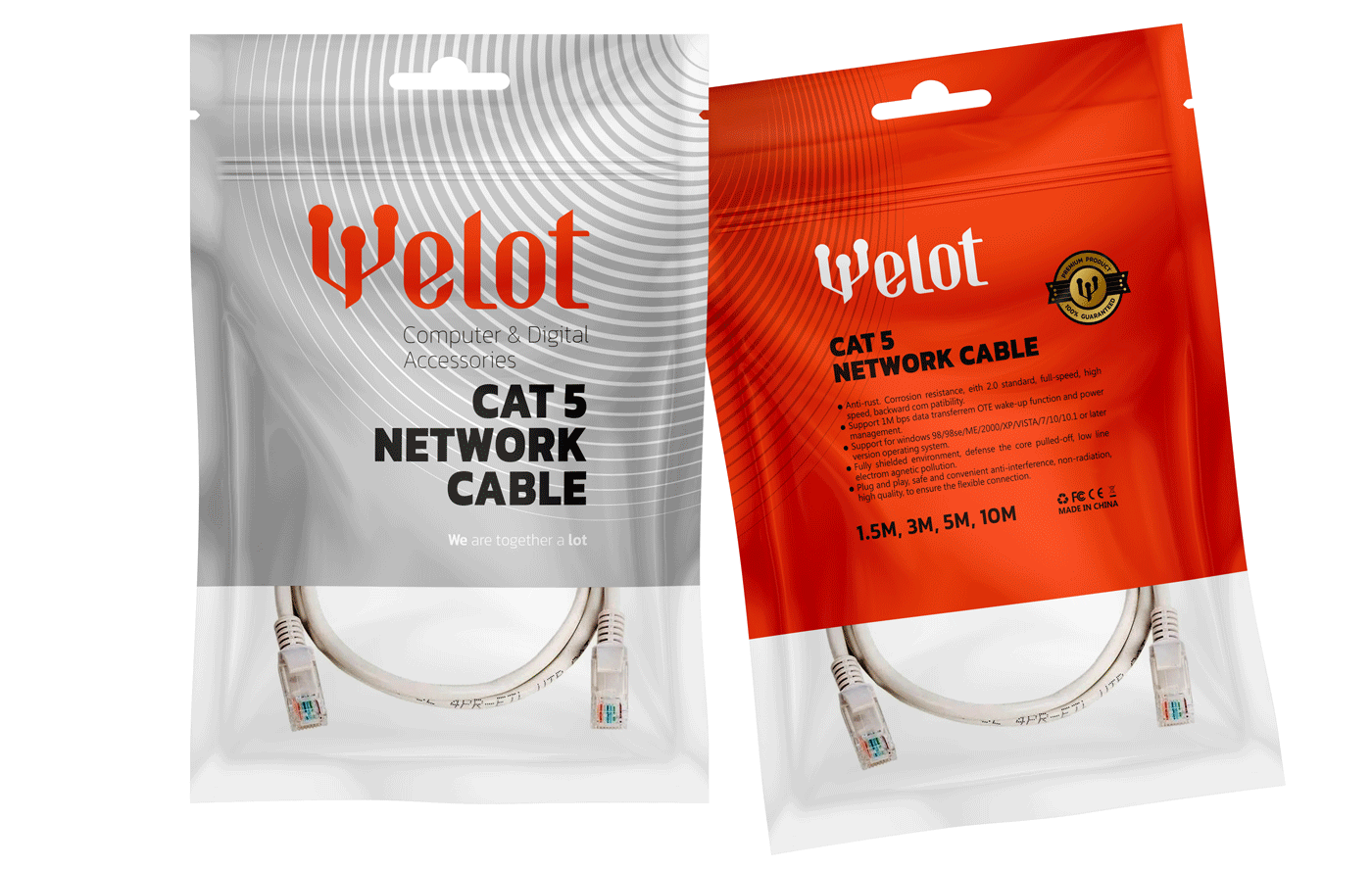
Design solution: While studying the market of this category of products, we noticed that most of the competitors, producers and suppliers have used busy digitized images, backgrounds with busy designs and full of visual effects in their packaging and social networks.
We wanted to create a moment of silence in the midst of this hustle and bustle. It was decided that instead of using busy visual elements, we would use a simple and large color spot next to the shape of the product in order to attract more attention and stand out in comparison with other brands. As well as convey confidence by creating a strong visual emphasis of the brand's strength.
In the same way, we used a simple sanserif font to type product names and used the same font family in other visual components of the brand.
Just send a message if you want to enhance your brand's visual identity or packaging design.